壓縮檔案有8mb,開啟速度會叫慢
解壓縮後的字型檔有14mb
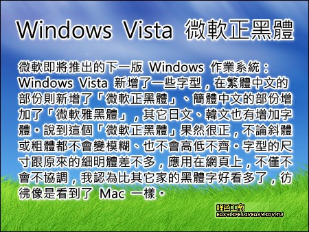
微軟即將推出的下一版 Windows 作業系統:Windows Vista 新增了一些字型,在繁體中文的部份則新增了「微軟正黑體」、簡體中文的部份增加了「微軟雅黑體」,其它日文、韓文也有增加字體。說到這個「微軟正黑體」果然很正,不論斜體或粗體都不會變模糊、也不會高低不齊。字型的尺寸跟原來的細明體差不多,應用在網頁上,不僅不會不協調,我認為比其它家的黑體字好看多了,彷彿像是看到了 Mac 一樣。
微軟正黑體&微軟正黑粗體.rar(免費空間下載)
[##_1L|1142117061.rar|style="width: 90px; height: 30px; border: 2px outset #796; background-color: #efd; background-repeat: no-repeat; background-position: center center; background-image: url('/image/extension/unknown.gif')"|_##][##_1L|1125372719.rar|style="width: 90px; height: 30px; border: 2px outset #796; background-color: #efd; background-repeat: no-repeat; background-position: center center; background-image: url('/image/extension/unknown.gif')"|_##]